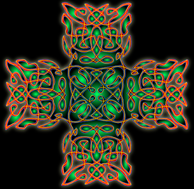
Version 1:

This version is just the base shape, the outline of the cross - if you will - overlayed with the original line design for highlight.
Version 2:

This version is just the 'holes', or the gaps between the original line design, without the base outline, and with the line overlayed for highlight.
Version 3:

This is a combination of the two above, with the base outline, the internal gaps, and then the line overlayed.
So what do you think? I'm toying with the idea of printing this out big enough to make a smallish poster.
PS Oh yeah, and in case you couldn't guess, this was made in Inkscape, whose praise I have sung before.
PPS Now that I'm looking at these in a smaller size, the combination looks a little better to me. I was looking at it in full-screen size, and it was a little overwhelming, but I still like it.
1 comment:
I like version 2. It looks all cool and futuristic. Version 3 looks a little evil to me, which is not something a cross should look. Maybe if you did blue instead of red...
Post a Comment